Showing posts with label color. Show all posts

Wednesday, November 27, 2019

Ed Wood Wednesdays, week 93: Let's badly colorize "Jail Bait" (1954)

Tampering with a classic.

NOTE: Let's be real here. It's Thanksgiving week. People are out of town or busy with relatives. It's very unlikely that anyone is even reading this article right now. So let's do something goofy and fun and meaningless. In other words, don't take this seriously. - J.B.

Always a bridesmaid.
When it comes to Ed Wood's filmography, three films tend to get all the attention: Plan 9 from Outer Space (1959), Glen or Glenda (1953), and Bride of the Monster (1955). They're the first of Ed's movies I saw back in 1992. They're also the ones depicted in Tim Burton's Ed Wood (1994). Not surprisingly, these are the titles that have been released the most times in the most formats for home viewing. In short, these are the three films that people know, even if that's pretty much all they know about Edward D. Wood, Jr.

Which means that Eddie's other films, including the 1954 crime drama Jail Bait, tend to get short shrift. Thanks to a company called Legend Films, Plan 9, Glenda, and Bride have all been released in computer-colorized form. While the colorization process deviates from the original intentions of the director and cinematographer, it also manages to bring out some background details that viewers might otherwise ignore. It also allows the films to reach viewers who might be averse to watching a black-and-white film.

To be honest, Jail Bait is probably never going to get the colorization treatment. It's nowhere near as popular as the other three films—Burton's biopic just skips right over it—and that sleazy, salacious title will probably keep many viewers away, even though it refers to a gun. Plus, there's that troubling, outdated blackface sequence featuring comedian Cotton Watts. Not to mention that there's no cross-dressing, nor any sci-fi or horror elements in the script. There's a lot working against Jail Bait.

Wednesday, February 22, 2017

How comic strips use color: A study in contrasts

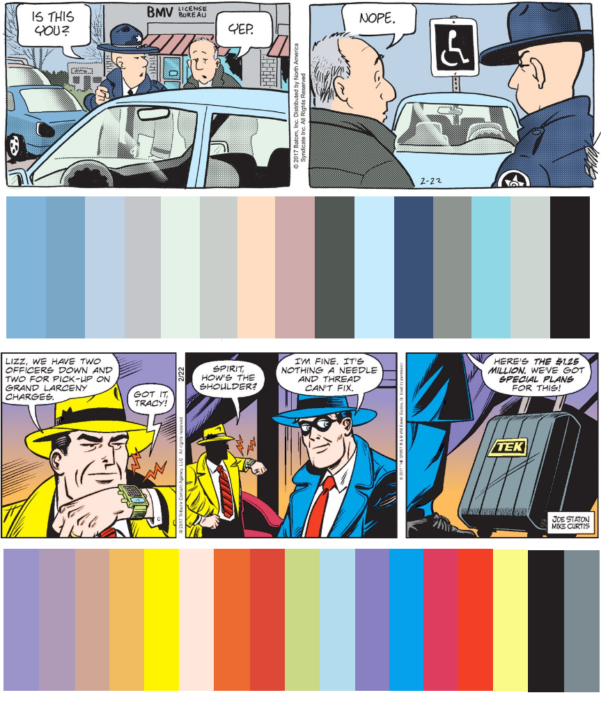
Color charts for Funky Winkerbean and Dick Tracy.

How comics used to look.
When I was growing up, only the Sunday comics were in color.  The rest of the week, the funnies—like most of the newspaper—were in black-and-white. But times change, and papers eventually started incorporating more and more color images in an ultimately futile effort to keep up with other media. It was a messy transition. In the mid-1980s, John Waters joked that color photographs in the newspaper were so blurry they looked like 3D movies without the benefit of glasses. But, today, even the front page of The New York Times (aka "The Old Gray Lady") is in color.

Meanwhile, print media has been all but entirely usurped by the internet, where color presents no added expenses or technical headaches. And since I now read comics online rather than in print, I've become used to seeing daily strips in color. But there is still a schism between weekdays and weekends. On Sundays, the artists themselves color their own strips. From Monday through Saturday, that chore is farmed out to subordinates hired by the syndicates. Comics blogger Josh Fruhlinger refers to these mysterious workers as "coloring drones."

As one might guess, these drones are hit-and-miss in their duties. Most days, they just go through the motions. Comic strips tend to be very repetitive, using the same characters, settings, and scenarios over and over again. It's not uncommon for the characters in these strips to wear the same outfits every day for decades. It gets to be very routine. But occasionally, a coloring drone will do something that stands out. Normally, this means making some boneheaded mistake, like accidentally giving a character blue skin or something. Or maybe it means that a drone put in some extra effort on a strip, e.g. depicting autumn leaves in various shades of red, gold, and brown.

At the top of this post, you'll see two contrasting strips, both of which ran today: Funky Winkerbean and Dick Tracy. You can see at a glance how wildly different these two strips are. Funky is a serialized comedy-drama about depressed, dilapidated, aging adults. It's supposed to be realistic and relatable. The title character, for instance, has spent the past few days at the Bureau of Motor Vehicles. Notice how drab the colors are: so many shades of blue, gray, and blueish-gray. Dick Tracy, on the other hand, is a highly stylized crime/action strip about a violent, trenchcoat-wearing detective who hasn't changed much since the 1940s. He's currently wrapping up a (ridiculous) case that teamed him up with The Spirit, another throwback crimefighter. The riotous color scheme tells you all you need to know about the over-the-top sensibility of this strip.

Just for further elucidation of this topic, here's a breakdown of today's Garfield. You'll notice that the palette is more limited than either Dick Tracy or Funky Winkerbean. This long-running strip goes for broad, obvious jokes, and that dedication to simplicity extends to its color choices. 


Yeah, Garfield only has about six colors.

Sunday, May 20, 2012

(today's zomby) An all-out zombie versus parrot epic!


Hi, folks! Hope you enjoyed today's epic-length Zomby! adventure. While digging through the vast Kotke archives, I discovered this unused, unfinished Sunday Zomby! cartoon. I don't remember what the joke was going to be, but I thought I'd let the unsettling image speak for itself...

Sunday, May 13, 2012

(today's zomby) And Anne Hathaway senses a requirement... a requirement for velocity!


Also, while you weren't paying attention, Anne Hathaway somehow became Maverick from Top Gun.


Which is Anne Hathaway and which is Tom Cruise? The world may never know.

Tom Cruise is so confused by these images. On the one hand, I'm pretty sure he'd like to screw the 1986 version of himself. On the other hand, well... you know, girls are icky and a well-documented source of cooties. Seeing what he finds attractive and what he finds repellent embodied in the same person would be traumatic for him. The experience might even take him to a scary place... a hazardous realm, if you will, or a perilous area. One might call it a sphere of jeopardy or a region of uncertainty.

If only there were some catchier way to phrase this.


Okay, that's closer to it. Let's table this for the moment and meet back here in a month.

Sunday, April 24, 2011

Experimental ZOMBY: A meditation on absence and abandonment


A suitcase on a bed. A closed door. A group of mirthless travelers standing in line. Finally, an empty airport. In today's Ziggy, these are merely the props and settings for a tired gag about airport security. But with the title character removed, this becomes a haunting meditation on absence and abandonment. Someone seems to be discarding his life and his home for unknown reasons, shedding his very existence like a snake sheds his skin. Perhaps all of these people in line are giving up their lives as well. Some catastrophe has caused them to leave behind all that they know. One is reminded of the brilliant 2000 Swedish film, Songs from the Second Floor, which you really ought to see right this minute. Perhaps the trailer will convince you. Keep in mind, the trailer is NSFW but it's Sunday so you shouldn't be at W anyway. Songs comes pretty darned close to being a zombie movie, as you'll soon see, so I hope it is covered someday on Mail Order Zombie.


And thus ends Experimental Zomby week. Join us tomorrow for "classic Zomby."

Tuesday, April 19, 2011

The Ziggy/Zomby coloring conundrum

Here, gentle reader, is how yesterday's Zomby Minus Zomby should have looked:


I said this was going to be an experimental week, and I see now that I was right.

It's been a few years since I did those original cartoons removing Ziggy from Ziggy, and since then something dreadful has happened to the coloring of the strip. Back then, the weekday Ziggys used solid blocks of flat color -- which to me worked very well with the very cartoony, stylized look of the feature and gave it a bold, bright look. Now, though, the colorists are using these wimpy "naturalistic" colors which fade in and out. It must be some cheap, easy Photoshop effect. In a word, I hate it. So I guess this week, I will also be "color correcting" the cartoons as I see fit.

Here's a side-by-side comparison of the two cartoons which illustrates the coloring difference. (Fading colors vs. solid colors.)